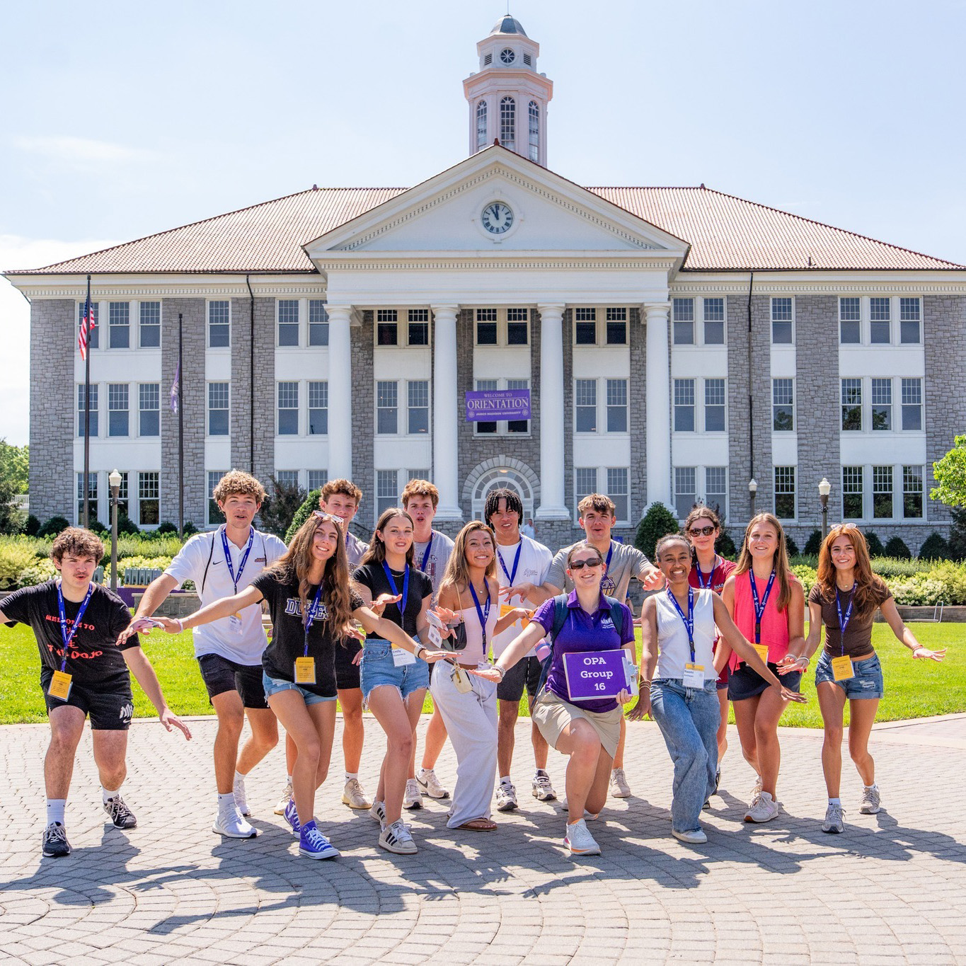
Harrisonburg, founded in 1779, developed from a small frontier settlement into a regional hub for trade and agriculture due to its location in the Shenandoah Valley. Since then, Harrisonburg has evolved into a diverse and dynamic community, home to institutions like JMU and EMU, known for its strong spirit of engagement and community connection.
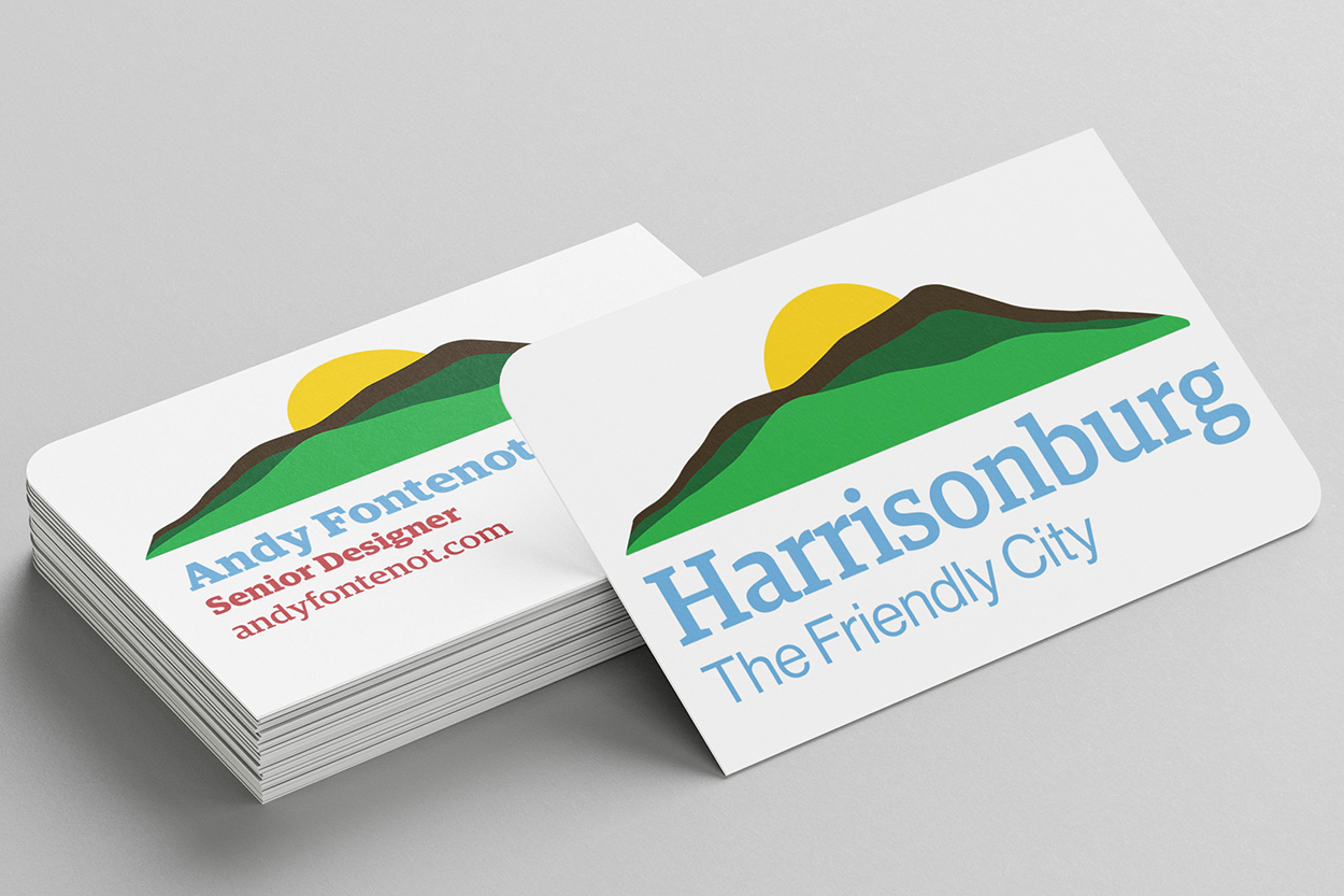
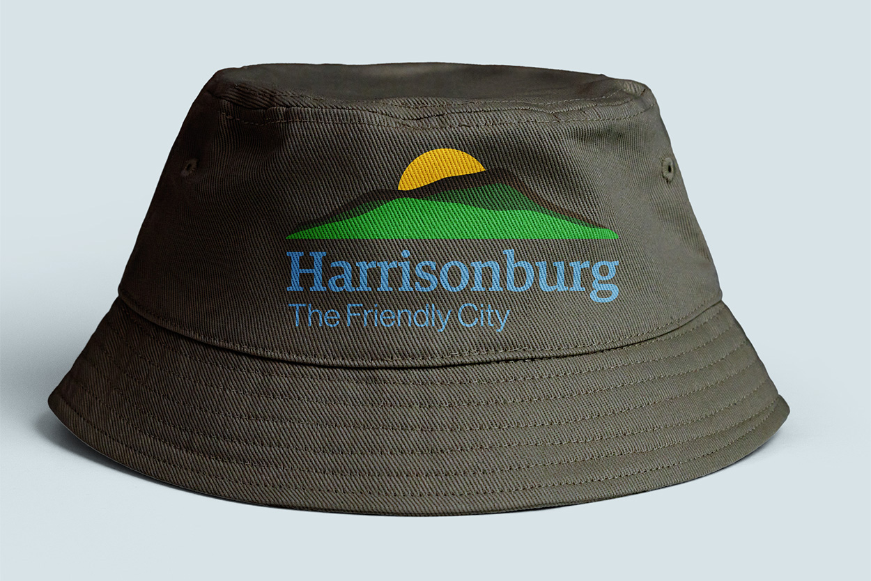
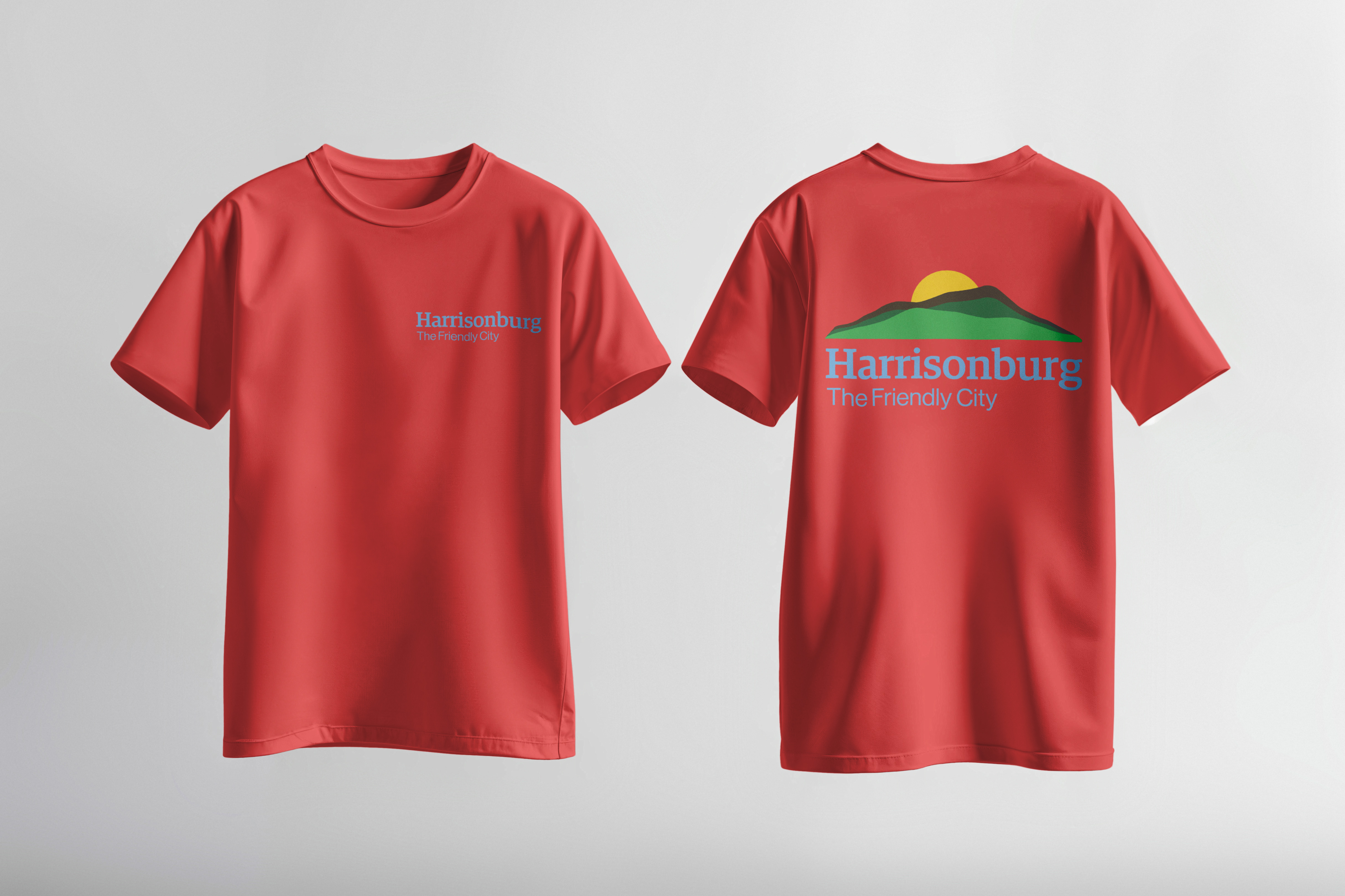
This project tasked us with refreshing Harrisonburg's tourism identity. Their existing logo was effective, but did effectively reflect its identity as "The Friendly City." Creating a new brand identity will help create stronger recognition for Harrisonburg.
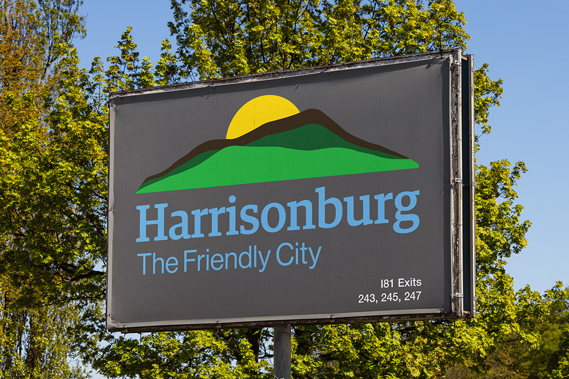
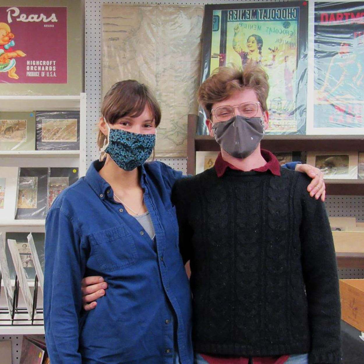
Rebranding Harrisonburg for tourism presented the challenge of capturing its cultural diversity, historic character, and modern energy in a clear and compelling way. Utilizing imagery was key, as the city draws from a mixture of historic downtown architecture, frequent community events, and youthful energy from local universities.
This project utilized warm, inviting tones and cohesive visuals to reflect both tradition and growth. Refining and unifying these elements will strengthen the city’s identity, helping Harrisonburg stand out as a welcoming destination.
Young professionals and full-time residents in Harrisonburg who are actively engaged in the local community through work, social life, and outdoor recreation in the Shenandoah Valley. This audience values the city’s balance of historic character and modern growth, and supports efforts that strengthen local identity, inclusivity, and long-term community development.
Individuals who visit or live near Taos and appreciate the natural beauty of the area, even if they are not frequent skiers. This audience often supports environmental advocacy groups and prefers to support local businesses that actively reduce energy use, water consumption, and waste.
HEADING: Baskerville URW Medium
HEADING: Calisto MT Bold